

What you are about to read:
This article from Brokerland is dedicated to one of the most fundamental topics, which is the types of forex charts. The more skilled a trader is in understanding and analyzing price action and price movements on charts, the more successful they are likely to be. In the fast-paced world of forex trading, understanding market dynamics and identifying potential trend are key to successful decision-making.
Among the wide spectrum of available analytical tools, different types of price charts serve as essential visual aids, providing valuable insights into price movements and market patterns for traders.
Read this article to learn forex, it introduces various types of charts in forex, including candlestick and bar charts, highlighting their importance and comparing them to reveal their power in decoding market behavior. We explore the unique features and advantages offered by these charting methods, as well as patterns and signals that traders can identify on these charts.
A proper understanding and the ability to examine various price charts in forex enable traders to make informed trading decisions and navigate confidently in the complex world of forex.
Visualizing price movements with forex charts
Traders use various types of forex charts for technical analysis. They analyze the past behavior and price movements of currency pairs and attempt to predict how prices will behave in the future. Indeed, accurate understanding and better analysis of these charts are among the essential factors in identifying order blocks and recognizing any patterns in the market, such as wedge patterns, rectangle chart patterns, flag patterns, or any other patterns.
Some types of forex charts in forex are better at finding these patterns, while others reduce market noise and make trend analysis easier. Each type of chart has its specific strengths and weaknesses, and based on your strategy, you should choose those that add the most value to your trading system.
Most forex brokers, including some we’ve introduced like Lite Forex or Alpari, offer various types of forex charts, accessible to users after opening a demo or real (live) account. There are also third-party companies that provide various forex price charts for free. In the following, we will discuss the most popular types of price charts: line charts, bar charts, and candlestick charts.
How to Read Price Charts?
Various types of forex charts, much like charts for other assets such as cryptocurrency, clearly depict current bid and ask price changes, making observation easier. Typically, these movements are represented in the form of lines, bars, or other shapes. Regarding the time frame, prices are recorded based on a tick (the smallest price change), one minute, one hour, one day, etc., allowing traders to choose different time intervals on the chart.
Long-term traders use charts with time frames longer than 1 hour, while daily traders use charts with time frames from 1 minute and above. Many traders also use various forex charts for multi-timeframe analysis. For instance, daily traders may use daily candlestick charts to observe the overall market trend and 1-hour or lower charts for trading local or reversal trends.
Types of forex charts, or price charts, essentially display price and time in the same manner, regardless of whether it’s for currencies, commodities, etc. Understanding the conditions of different charts and their types is crucial for selecting the most suitable type for your strategy. The x-axis, which is the horizontal line, represents the time of price increase or decrease, and the y-axis, which is the vertical line, represents the price at a specific time.
Since there is a time dimension in the chart, traders can observe prices that have been recorded in the past. As we are reading various types of price charts in forex, this price refers to the exchange rate of a currency pair, and depending on the chosen time intervals, price movements are shown in ticks, minutes, hours, days, or even years, making it easy to switch between different views with zooming in or out. Additionally, examining these charts can reveal the currency correlation beyond their prices.
Types of Forex Charts
Almost all forex brokers provide free charts included in their trading packages, and when traders download platforms like MetaTrader 4, MetaTrader 5, or cTrader offered by brokers like Fibo Group in the cTrader NDD account, various charts are automatically available to them.
Apart from brokers and their trading software, third-party charting programs like TradingView also exist, offering various forex price charts for free. It’s worth noting that TradingView is not a broker. Many traders use service provider charting methods and execute trades using platforms like MetaTrader or other trading platforms.
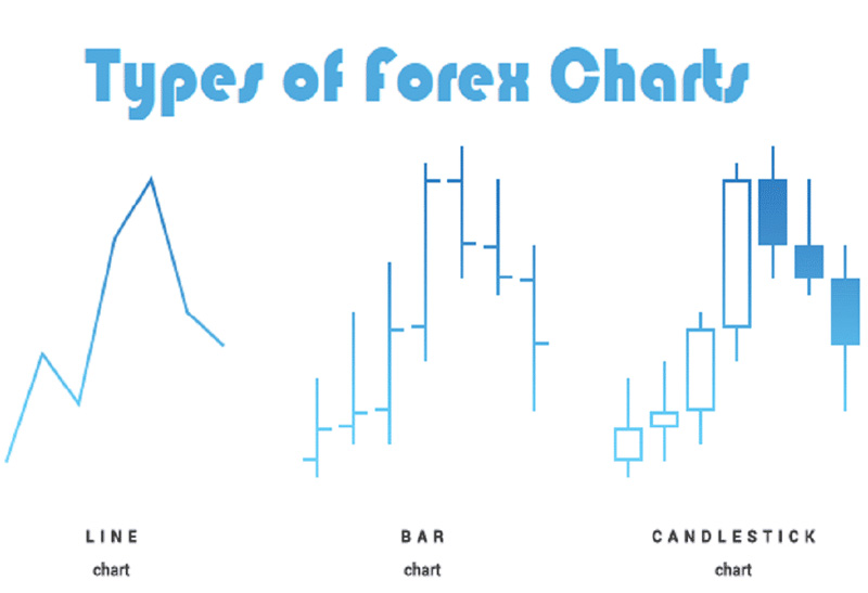
There are multiple types of forex charts, but the most popular ones are the following three:
- Line Charts
- Bar Charts
- Candlestick Charts
Line Charts in Forex
Among the types of forex charts, the line chart is the most basic and simple one for displaying price. Essentially, different price points of a specific asset are identified on the chart, and then adjacent points are connected with a continuous line.
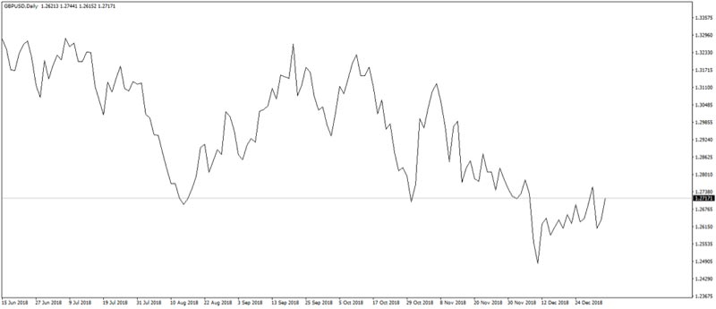
In fact, understanding line charts is quite simple. This is because they only depict the closing prices of currency pairs. Therefore, for traders who want more complex information such as opening prices or high/low prices, a line chart may not provide them, and, for example, price gaps or price discontinuities are not visible or detectable in this type of chart.
Traders in forex who use line charts find them helpful in reducing market noise and simplifying trend analysis. However, you cannot easily use them to identify price patterns or harmonic patterns. Candlestick charts are rarely used by traders for displaying the prices of currency pairs.
Bar Charts
Unlike line charts, bar charts are more complex and provide more information compared to the previous chart type. Essentially, this chart displays four different prices of a currency pair within a specified time frame (minute, hour, day, or more).
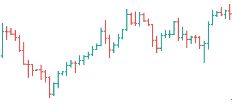
In this context, there are four prices: the top and bottom ends of the bar represent the highest and lowest prices of the asset in that time period. A short vertical line on the left side indicates the opening price, and the same line on the right side indicates the closing price. Bar charts are more common than line charts, but most traders prefer to use candlestick charts in their analysis among the various types of price charts in forex.
Bar charts are much more complex for obvious reasons than line charts. While a line chart shows one price, a bar chart does this for four different prices. However, when it comes to the most complex type of chart, even bar charts are not sufficient.
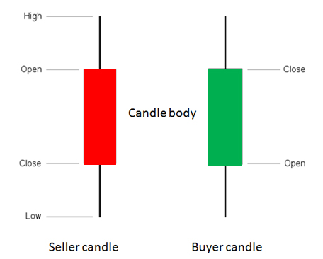
Candlestick Charts (the most popular price chart)
Japanese candlesticks display similar information to bar charts, with the only difference being the visualization. Candlestick charts are more attractive to traders as they have thicker bodies, making it easier to identify patterns. Various candlestick patterns have been discovered by traders and analysts in the market, and these patterns are an essential part of technical analysis and are used by forex experts advisor.
Japanese candlesticks, as the name suggests, come from Japan, but did you know that this type of forex chart was created by rice traders? Rice traders created charts by hand to determine the best trading prices. They also discovered various patterns that repeat over time.
Candlesticks enable traders to identify bullish and bearish markets and look into market psychology, which is widely used in sentiment analysis. This is why they have become very popular today. Candlestick charts are the most popular method for visualizing price movements in a specific time frame.
While bar charts only show four prices in a time range, and line charts show only one price over a longer period, candlestick charts display four prices over a longer time frame. In summary, individual candlesticks are arranged in a specific time period and show the open/close and high/low prices of a currency pair.
In this type of chart among various forex charts, the distance between the short vertical lines (open/close) of the candle body is called the “real body” and indicates whether the trader has had a successful trade or not. If the body of the candle is white/green, it means the opening price was lower than the closing price, and the trader sold a currency pair at a higher price, making a profit.
On the other hand, if the body of the candle is black/red, the opening price was higher than the closing price, indicating that the trader sold a currency pair at a lower price and incurred a loss.
Using Various Types of Forex Charts in Technical and Fundamental Analysis
Now that we’ve explained the types of charts available in Forex and which ones are more popular, one unanswered question remains: Why do traders use different price charts in Forex?
Technical traders, who study patterns and extensively use the best forex indicators such as the Moving Average (MA) – one of the most commonly used – or the Pivot Point indicator, tend to use candlestick charts. On the other hand, traders who focus entirely on fundamentals and give importance to the overall price trend may use line charts.
Technical analysis in Forex is essentially a method of reading charts and making predictions about whether the price of a Forex currency pair will increase or decrease in the future. There are two likely scenarios that can be read from different types of price charts in Forex: If the exchange rate of a currency pair is increasing from the left side of the chart to the right, it means the market is in an uptrend – essentially expanding, and buyers are in a favorable position.
If the exchange rate from the left side of the chart to the right is decreasing, it means the market is in a downtrend – contracting, and sellers are in an unfavorable position. These scenarios may seem straightforward, but these long-term trends usually persist. However, it does not mean that different types of charts in Forex always lead to accurate conclusions and are always correct.
In some cases, the upward/downward trend may change drastically due to a sudden event in the market. For example, the release of major Forex news, such as changes in the central bank interest rate or various global events, can cause significant reactions and sudden changes in prices.
Final Words
Familiarity with different types of price charts in Forex is crucial and a fundamental aspect of Forex education. Understanding them and the purposes of each can aid in making use of them in trades, regardless of the strategy, whether it’s anti-martingale or Ichimoku equilibrium trading. Another type of price chart in Forex is the Renko chart, which we have introduced and discussed in a separate article. Share your opinions below this article to accompany us.


